Challenge
Wuze approached us with the Challenge to refresh their complete product line & make the products look unique, attractive & keeping the consumers well informed about the product but without changing existing bottles & Jars. With Previous packaging it was difficult to attract consumers' eyes, it was dull & lack brand appeal. Product range was getting overshadowed by other competitors. They want to have Design that can hold the eye of target Consumers & stand out on the shelf to help them build their relationship with consumers & grow.
Solution
In our brainstorming sessions with client, we understood the problem areas in details & pulled out the maximum information & insight required to solve this problem. They need a packaging that can stand out & communicate all the aspects of product also at the same time make their consumer feel that naturopathy products can be beautiful looking with great impact on their health.
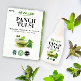
Layout & color
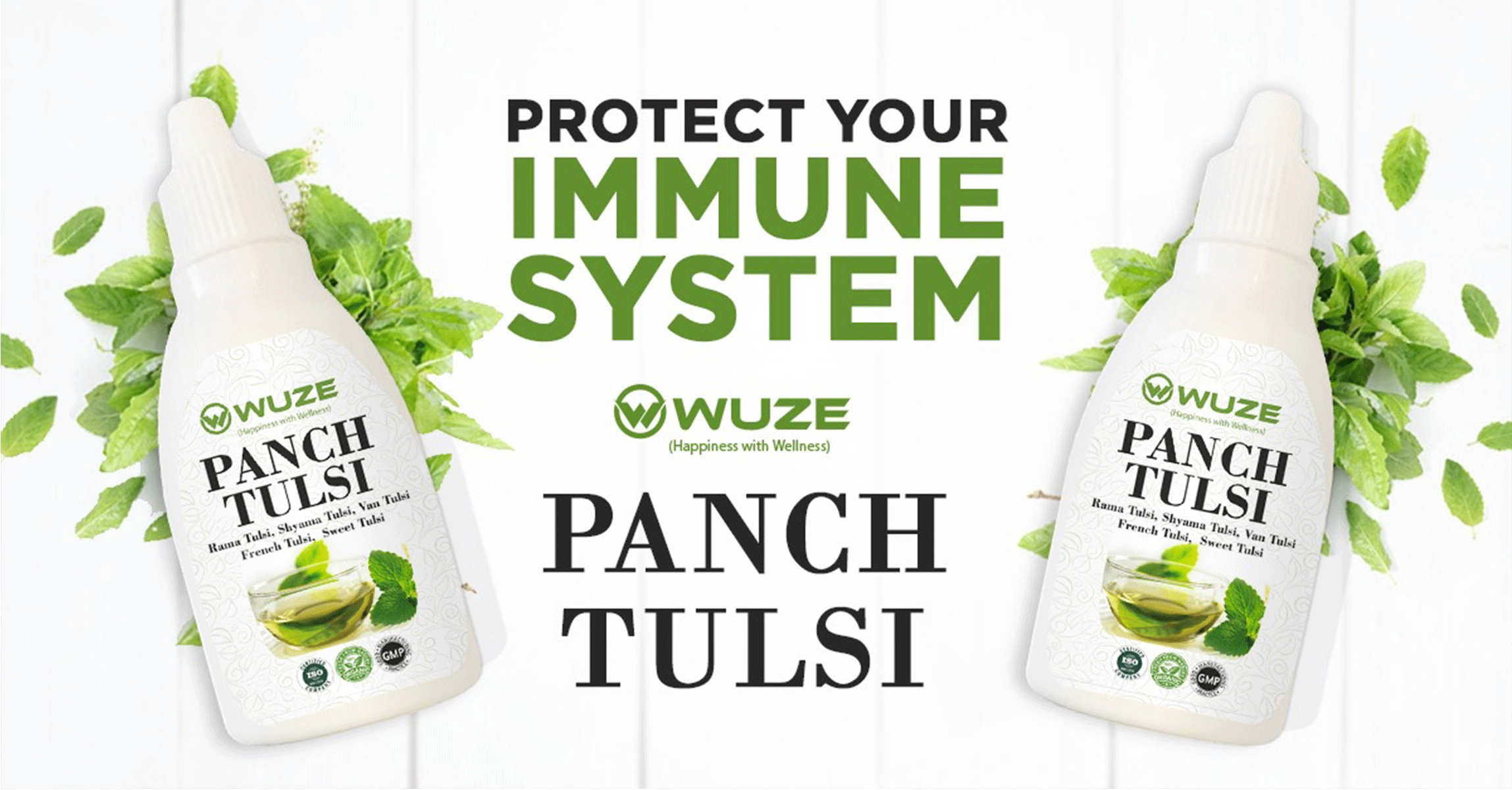
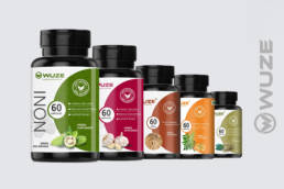
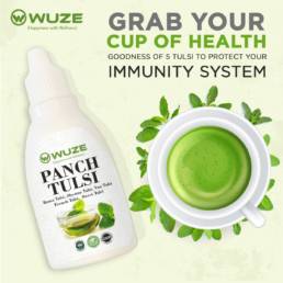
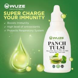
Basis on all the inputs, given a clean design architecture for each product like D-Tox Juice, Capsules, Tablets, Panch Tulsi Drops etc. We have worked on each flavor & picked vibrant color palettes at the same time used the striped rectangular section to name the product/Juice to make it stand out & clear.
Imagery
Created a subtle abstract background for the outer box along with inside bottle along with that Used beautiful images of key ingredient or flavor to make it look more playful, attractive & informative at the same time so, by looking at the outer box only consumer can get the idea of ingredients of the Detox Juice like Black Pepper seeds, Amla, Aloe vera etc. help each flavor stand out on the shelf.
Typography
Used the combination of Bold & Sleek font family for product name, flavor & all information. Used Bold font for naming & sleek fonts for other important information to make everything look classy & readable to efficiently communicate all the required information about the product details to the consumer to encourage them to make the right informed buying decision.
01. Homepage layout
02. Collections Overview
03. Collections Details
Impact
As result, they received a great response from new consumers & appreciation from the existing users for the new refreshed packaging. It also helped them with increased order & numbers of queries from the new consumers. It turned out a well-worked successful project that client felt proud to promote on their online platforms & market & appreciated our work on Google business profile as well.
Feel free to check out the appreciation in Testimonial Section.